
ComiXology App Redesign
As an avid comic reader, comiXology has been a go-to app for keeping up to date with weekly releases, whilst also reducing the amount of space taken up by physical copies. However, I felt the current app (recently acquired by Amazon) was lacking in some fundamental features when it came to usability and clarity.

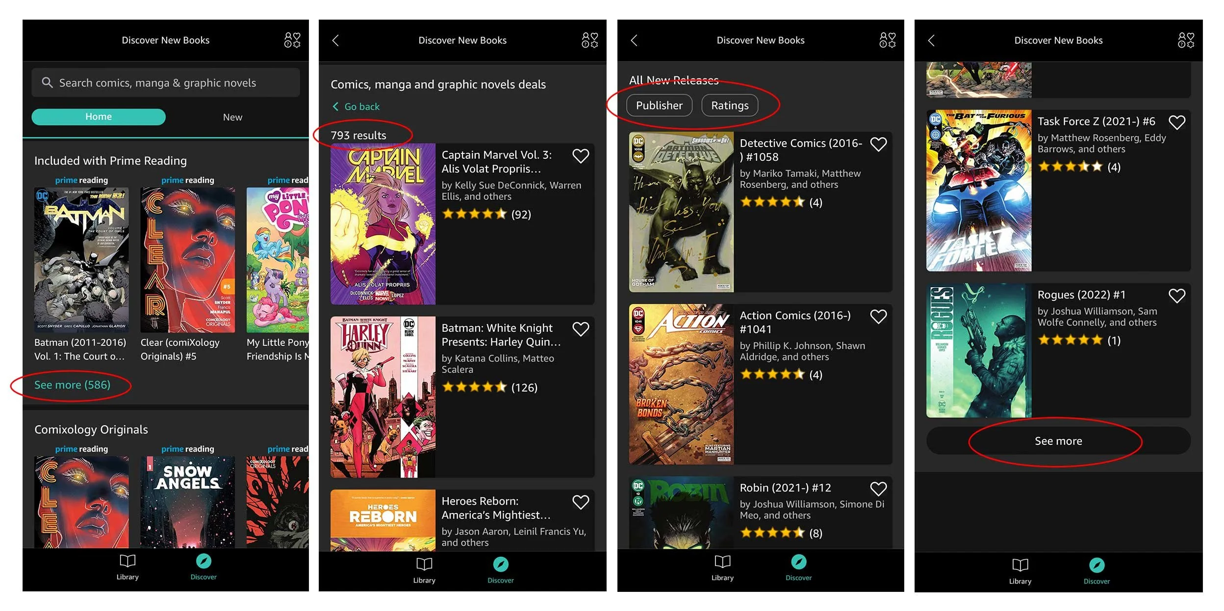
I was not alone in this opinion. A quick search on Twitter revealed several angry tweets aimed towards Amazon and their new acquisition, with users calling the new app ‘truly unusable’, and ‘Infuriating’, with many contemplating switching to another service entirely.
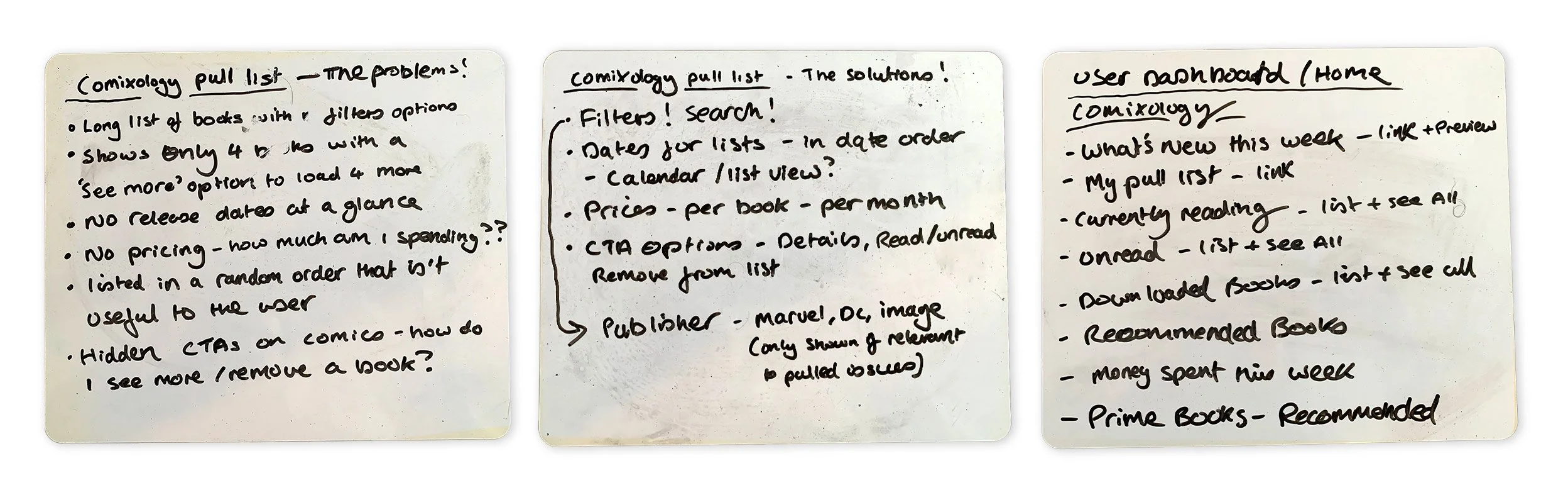
The key highlights I took away from my own experience using the app, and complaints of others were:
The current ComiXology app interface
It is difficult to navigate your books, including purchases, pull lists, and downloaded items.
It is unclear how to find new books, especially new releases, with some lists in completely random order with no options to alter this.
Filter options are very limited, making any search a nightmare of continuous scrolling and ‘reveal more’ CTAs.
Prices aren’t featured anywhere, so users have no idea how much they are spending per week or per month.
The app looked nothing like an Amazon product, and it had lost all the branding of the previous comiXology app.

I felt that the app could benefit from a user dashboard – a home that would house (from my experience) the most useful features of the comiXology app, as well as being a launching point for discovery.
My focus was on four key areas:
Home page
User Library
Easy Search
User Pull List

I built my idea in Adobe UX using simple wireframes to plot out everything that I wanted to feature within my four chosen sections.
To help populate these sections, I conducted my own research by asking users on Twitter what they would find most useful in the app. This informed my decisions, especially for the home section as many users wanted an easy way to see what books were released , while also being able to quickly see what they were currently reading. They also wanted to be able to explore within the app, and discover new books - much like visiting a comic book shop!

I then built the interface for the app, creating a hybrid look between an Amazon app and ComiXology. I studied Amazon’s current brand guidelines to achieve this, whilst also looking back over the previous version of the ComiXology website. The result was an interface that was much more in-line with other Amazon products.
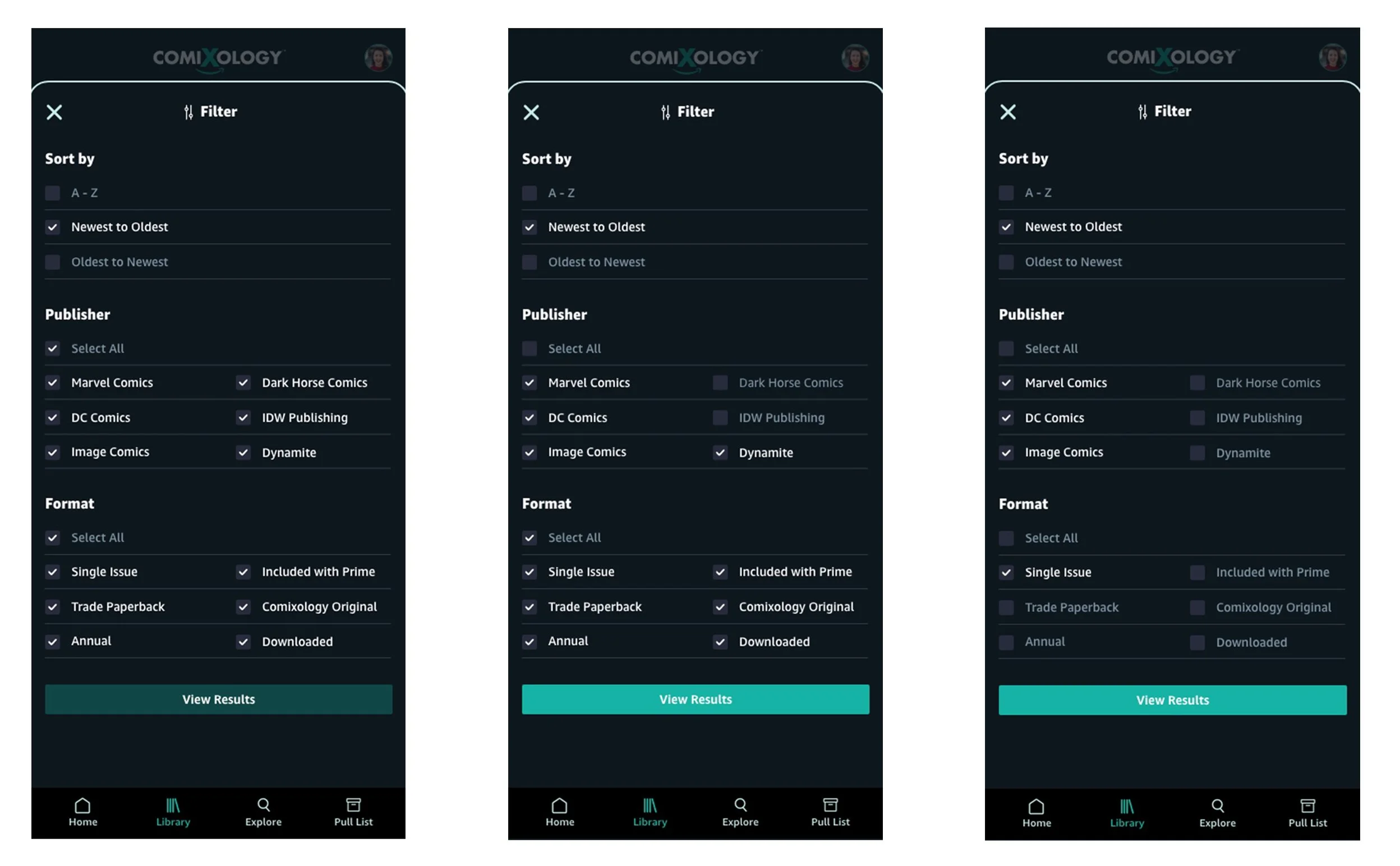
As mentioned earlier, one main problem that I noticed mentioned a lot on Twitter (and by myself!) was that there are currently no filter options in the user library, so I spent a bit of time researching what filters would work best for a library of comic books. My solution incorporated what I felt would be the most useful filter options - sorting order, publishers and book format.
I look forward to exploring this further as I gather feedback from my prototype.