
Greggs POS System
GEMS 2.0
Launching their in-house POS system in 2001 was a huge achievement for Greggs. By 2022, with constant maintenance and a till that was slow and complex to use, it was time to upgrade.
As the sole UX/UI designer, I was part of an ambitious project to redesign the POS system experience, to be rolled out across the entire Greggs estate - getting sausage rolls into hands faster than ever before.
Problem statement
The current POS system at Greggs is outdated, requiring frequent maintenance that disrupts daily operations and strains IT support. Its unintuitive design makes it difficult for new employees to learn, slowing service and increasing reliance on experienced staff. These inefficiencies lead to rigid workflows, longer wait times for customers, and added pressure on colleagues - making the system unfit for a fast-paced, customer-focused retail environment.

Deliver a modern, reliable POS system foundation
Increase speed of service for colleagues and customers
Build trust and collaboration with shop colleagues
Roll out to 2000+ shops across the Greggs estate
Project Goals
My Role & Responsibility
Discovery
Stakeholder interviews
Gather requirements
Create personas
Competitor analysis
Research
Training on current system
Shop colleague observation
Journey Mapping
Usability testing (baseline)
UI/UX Design
Wireframes and high-fidelity prototypes
Moderated Usability Testing
Create and maintain a design system library
Present to stakeholders
Discovery
Who Uses It?
Our primary stakeholders were shop colleagues, as they interact with the current system daily and rely on it as the shop’s largest revenue channel. I interviewed and observed shop colleagues to gain insight into their workplace behaviours, motivations, fears, and needs. By speaking with individuals across different roles - including shop managers, supervisors, and shift colleagues - I was able to gather a broad range of perspectives and experiences, which helped me to create detailed personas.
I used personas constantly throughout the project to guide design decisions, priorities, and create empathy amongst the team.

I used ‘Gemma’ as a guiding persona throughout the project, understanding that by making the till more reliable, easier to train on, and faster to use, we wouldn’t just improve her day-to-day experience, but enhance the overall working environment for all colleagues.
Research & Testing
IN THE TRENCHES
Before diving into the design process, I needed to understand the existing system used in shops and the experience it offered to colleagues. To do this, I put on an apron and hair net and worked a few shifts myself, completing the same till training that new colleagues undergo.
As a ‘new starter’, I found the system difficult to navigate and often struggled to locate products quickly. However, when observing experienced colleagues, it was clear they operated it with ease, relying heavily on muscle memory - a key factor I needed to keep in mind when approaching the redesign.
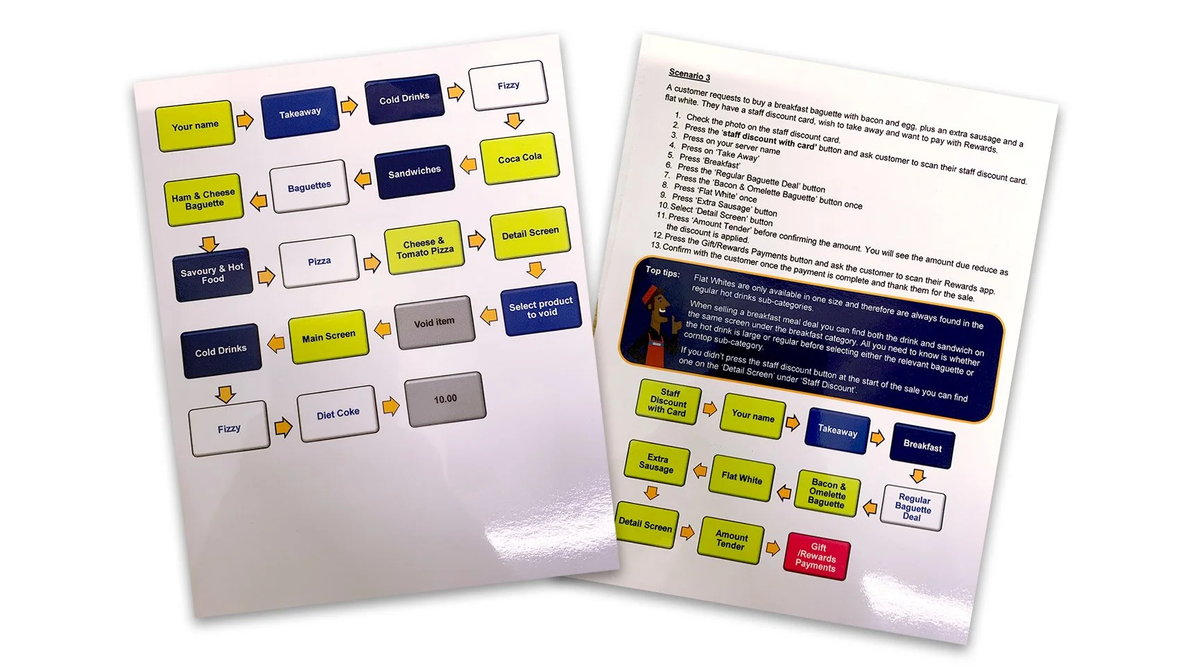
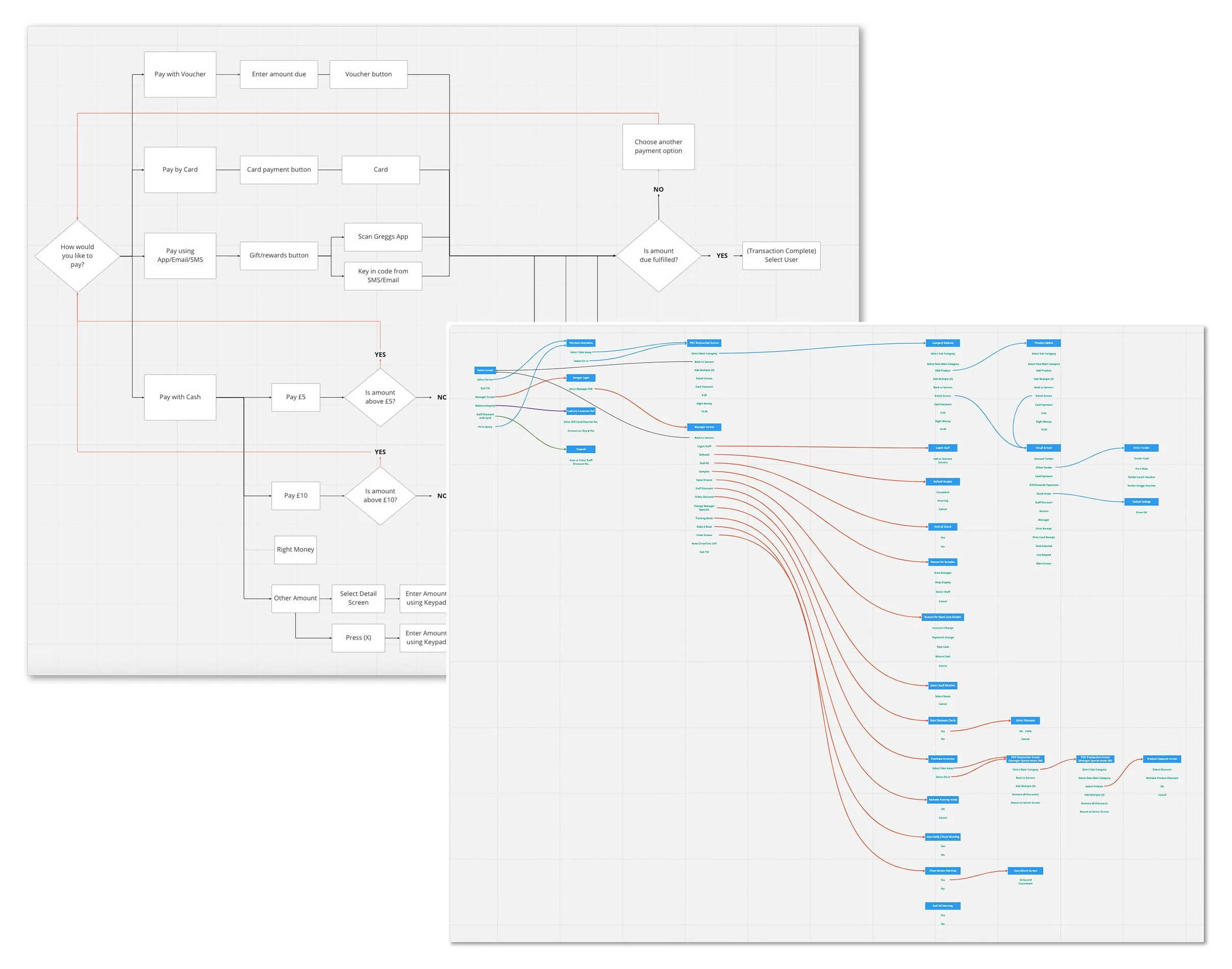
After completing my training, I created a comprehensive site map of the entire till system to solidify my understanding of its structure and functionality. I also mapped out key user flows, including common payment methods such as card, cash, the Greggs app, and vouchers. This process helped me break down each step a colleague takes when serving a customer, highlighting pain points and inefficiencies in the existing experience. By visualising the system in this way, I was able to identify areas of friction and opportunities for improvement.
Understanding Shops Better

During this phase, I discovered three frequent pain points for colleagues:
Because app scans had to be activated at the till, customers often scanned too early. The scanner beeped regardless, leading them to believe it worked - resulting in missed rewards and complaints.

Customers often changed their mind about dining in or taking away after the transaction began, but with no way to update this, colleagues had to restart the order to apply the correct VAT, slowing queue times.

Functions like refunds and voids require a manager’s PIN, but with managers not always immediately available, resolving customer issues often takes longer than necessary.
UX/UI Design
Designing GEMS 2.0
With a clear grasp of the system’s layout and core interactions, I felt well-equipped to move into the design phase with confidence and purpose.
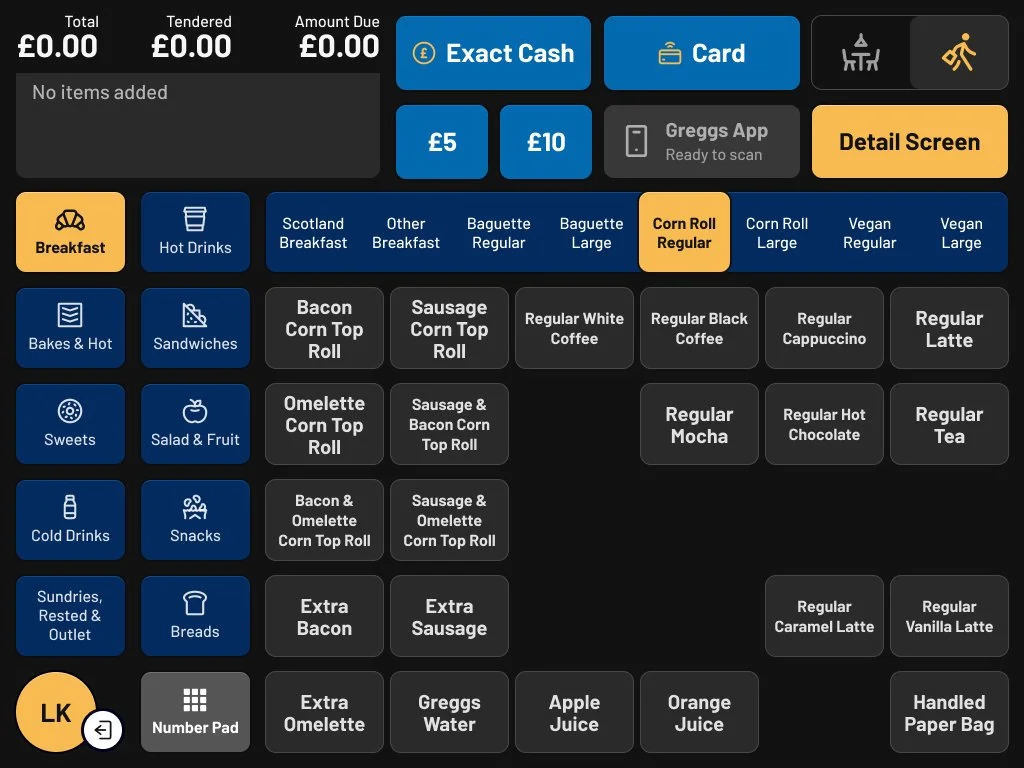
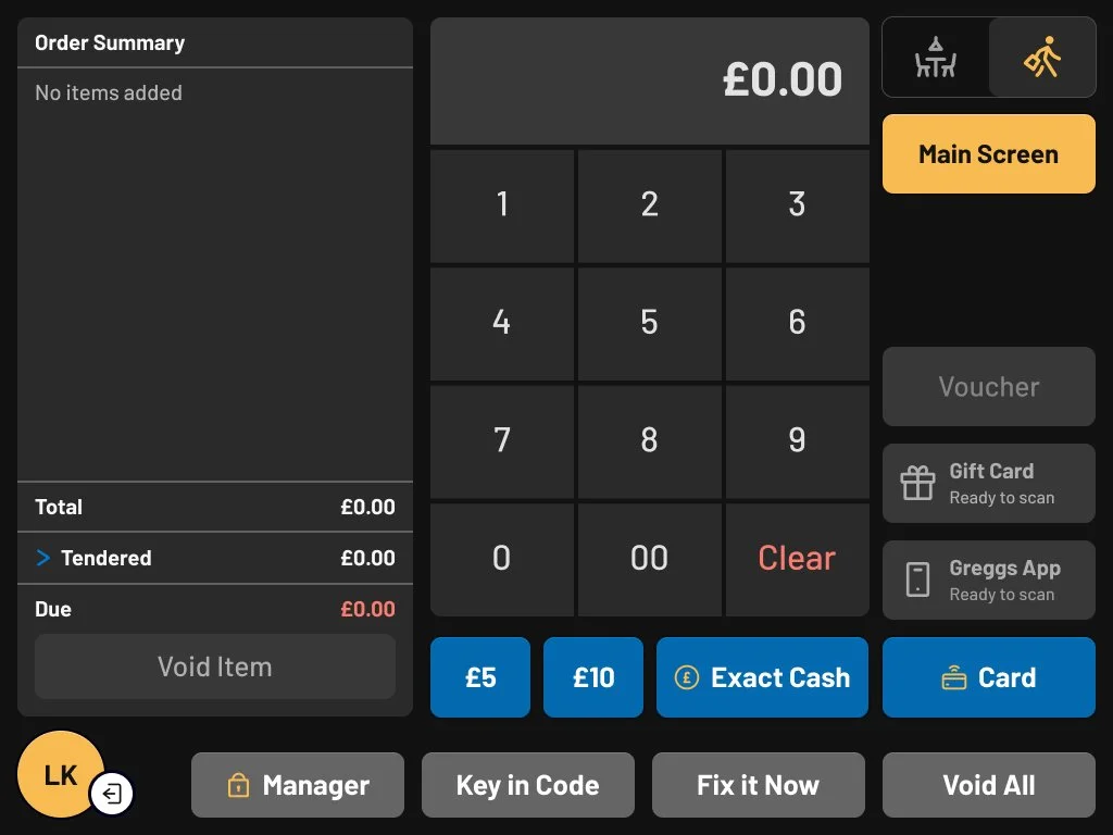
Early on, I chose not to change the placement of product buttons, as they were embedded in colleagues’ muscle memory, and moving them could disrupt workflows and slow service. Instead, I focused on improving the overall UI - enhancing visual clarity, defining intuitive touchpoints, and refining calls to action.
Accessibility was also a key priority, ensuring all colleagues could use the system confidently, regardless of ability or experience.
new features
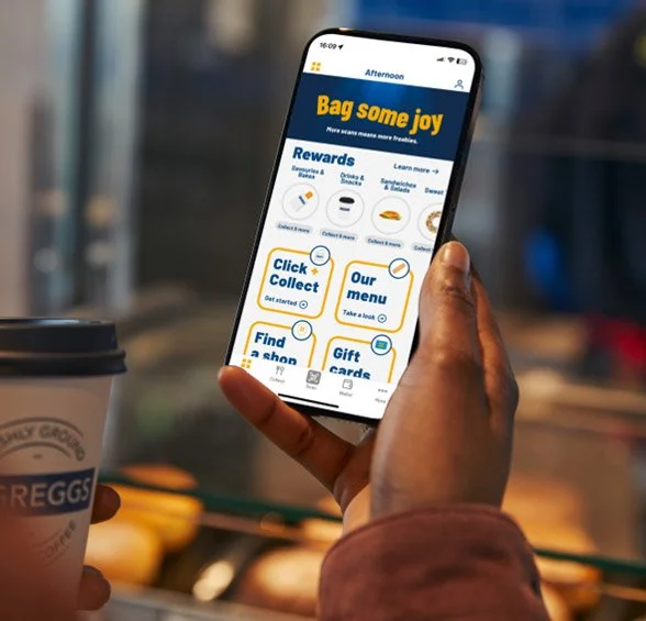
I introduced 'Flexi-Scan', allowing customers to scan their app at any point - without needing a colleague to activate the scanner at the till.

Colleagues can easily switch between sit-in and takeaway using a toggle, with prices updating automatically if the customer changes their mind.

Refunds and voids were opened up to all colleagues, reducing manager reliance and helping keep customers happy and queues moving.
The Trial
The new POS system was rolled out in four trial shops, providing a controlled setting to observe real-world use and gather feedback. I spent time with colleagues, using short questionnaires and in-shop observations to understand how the system performed during different periods of the day. This hands-on approach revealed both obvious and subtle usability issues, while also building trust and encouraging open, constructive feedback.


A key issue that quickly emerged was the use of light colour - many colleagues reported eye strain and, in some cases, headaches after prolonged use. They also found that after a few hours, the interface began to visually blur, making it harder to distinguish between different elements on the screen.

77% of users mentioned colour as the thing they liked the least about the new till
However, the new features were well received, with colleagues appreciating the flexibility of the sit-in/take-out toggle, the ability to resolve customiser issues independently without involving a manager, and most importantly, customers now being able to scan their Greggs app at any time.

62% of users mentioned app scans as the thing they liked the most about the new till
listening to feedback
As the trial expanded to more shops, it became clear that colour was a growing concern that needed to be addressed before a full rollout of the new till system. Colleagues reported issues with screen glare and visual fatigue, especially during longer shifts. To better understand the problem, I conducted additional surveys and visited a range of trial locations to observe usage and gather direct feedback. This research helped guide my design decisions, leading to the introduction of dark mode principles. By shifting to a darker, more eye-friendly interface, I aimed to reduce strain from prolonged screen use and create a more comfortable and accessible experience for colleagues across all environments.
continuous improvement
The new POS system was successfully rolled out across most of the estate, but my work didn’t stop there. As part of my UX process of continuous improvement, I conducted a follow-up survey six months post-launch to gain deeper insight into how the system was performing in-store, this time drawing on feedback from a much larger user base.
The results were encouraging. Colleagues reported that:
The new till was intuitive and easy to use
They could quickly and easily find what they needed
Transactions could be completed smoothly and without issues
Minimal support or training was required before they felt confident using the system
Although the updated colours were a significant improvement, some colleagues still found the interface challenging and requested greater contrast between buttons and the background. In response, I refined the UI colour palette and brought updated prototypes into shops. There, I observed and recorded colleagues as they completed tasks using pre-built prototypes to validate the effectiveness of the design changes.
I also surveyed all colleagues to gather feedback on the proposed changes before finalising them. An overwhelming 91% preferred the new design over the existing one, citing improved brightness, stronger colour contrast, and greater readability as key benefits.
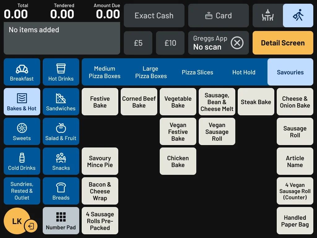

Following this update, I collaborated closely with colleagues to develop a product tagging system. The goal was to link product types - such as meat, vegetarian, and vegan - to distinct, easily recognisable colours. This system was implemented to make it quicker and easier for colleagues to identify products during transactions.
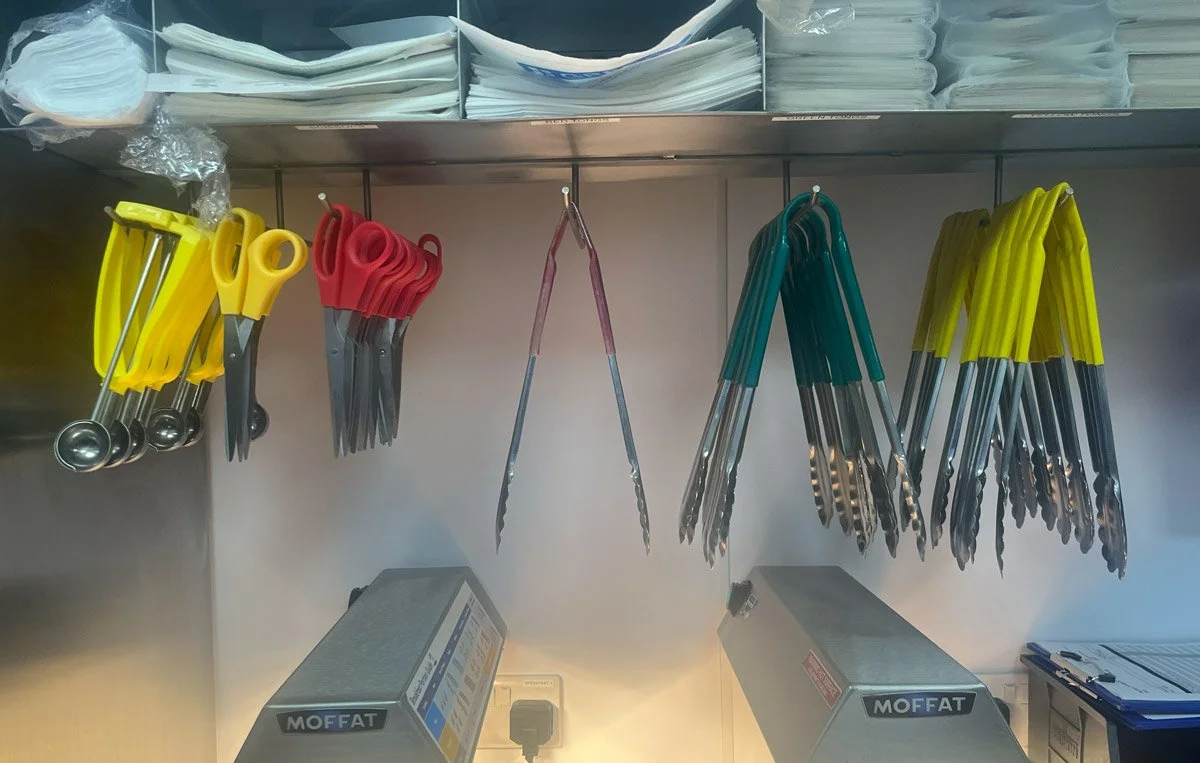
Crucially, the colours chosen for each product category were intentionally matched to the colour-coded tongs already used in shops for food handling, creating a consistent visual language across digital and physical touchpoints.

Conclusion
Working on the Greggs POS System was a rewarding experience that allowed me to apply user-centered design principles to a complex, real-world challenge. From the outset, I focused on understanding the needs of shop colleagues and customers, using research and prototyping to create a system that improves speed, accuracy, and ease of use. The system foundation offers a platform that is not only functional and reliable, but also capable of supporting future business growth.
It was fulfilling to see how thoughtful design could have a direct, positive impact on day-to-day operations, and the project reaffirmed my belief in the value of designing with empathy, clarity, and purpose.