
Greggs KITCHEN MANAGEMENT SYSTEM
In 2025, Greggs decided to trial touchscreen ordering in shops, creating a new order channel for customers.
As the sole UX/UI designer on the project, I was responsible for designing a system capable of managing these in-store orders - while also laying the foundation to support all future digital ordering channels.
Problem statement
Greggs needed a kitchen management system that could efficiently handle and prioritise orders from a newly introduced touchscreen ordering channel. The existing workflows were not equipped to manage the increased volume or real-time coordination required, leading to delays, confusion, and inefficiencies in the back-of-house operations.

Improve order visibility and prioritisation for colleagues.
Reduce preparation errors and miscommunication.
Support high volumes of orders during peak trading times without slowing down operations.
Design an intuitive interface tailored to fast-paced kitchen environments.
Enable clear status updates for each order
Ensure the system is scalable for rollout across multiple digital channels (Uber, Just Eat, Greggs Click & Collect)
Project Goals
research and insights
With a tight six-month deadline to launch both the touchscreen ordering and kitchen management system in a live shop, I needed to move quickly with my research. I began by examining the existing drive-thru order display system - not designed for touchscreen orders, but a useful reference point. It provided early insights into what was working, what wasn’t, and how colleagues felt about using it to manage and fulfil customer orders.

Key insights:
The screen was display-only, offering no interactivity for colleagues.
It showed a limited number of orders at once, restricting visibility.
There was no clear distinction between active and inactive orders.
Items within orders lacked categorisation, making them harder to process.
Customisations were unclear or easy to miss.
Text size was too small, reducing readability in a fast-paced environment.
Product names were often abbreviated, making them difficult for colleagues to read and follow accurately.
design approach
With the fast pace of a busy kitchen in mind, I took an iterative approach to designing the system - starting with rough wireframes and testing early ideas directly with shop colleagues. Getting their input early on was key to understanding what actually works in the real world, not just on paper.
The aim was to design a system that felt intuitive and gave colleagues a greater sense of control - especially during busy periods. Orders moved through three clear stages, helping colleagues quickly see what was in progress and what was ready, while also making it easier for customers to know when to collect their order.
After testing the interface with colleagues in a live shop environment over the course of two weeks, I gained valuable insights into how the system performed under real-world conditions. Seeing how colleagues interacted with it during busy periods helped highlight what was working well and where things needed to improve. Based on this feedback, I refined the direction of the design and introduced several key improvements:
Interactive order management
Colleagues could now actively interact with the screen to update order statuses, giving them more control over workflow and improving team communication.

Customisation awareness
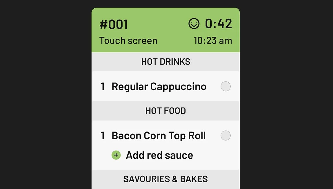
Customised items were highlighted with clear visual cues, making special requests easy to spot and reducing the risk of them being missed during preparation.
Product categorisation
Products within each order were grouped by category to help colleagues collect items more efficiently from different stations. They were also sorted by preparation time, with longer items - like coffee - appearing at the top to ensure they were started first and everything was ready at the same time.
Order status clarity
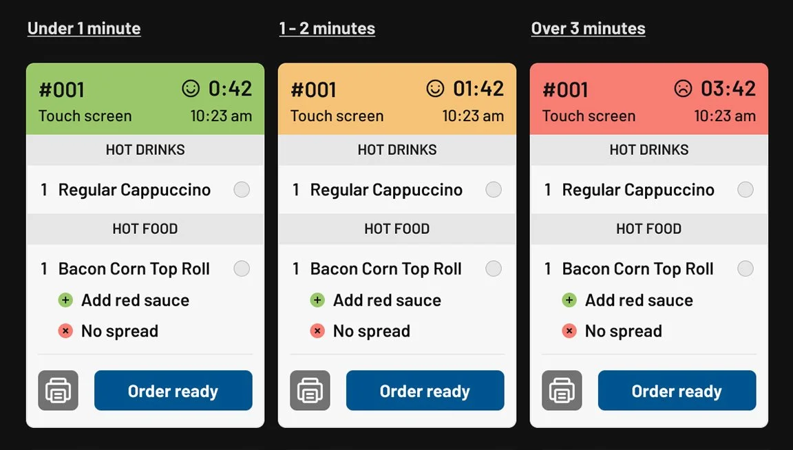
Orders were colour-coded based on how long they had been active, helping colleagues quickly identify which ones needed to be prioritised to maintain customer satisfaction.

Improved readability
I used a larger, more legible typeface and avoided abbreviations, ensuring that product names could be read quickly and accurately - even from a distance.
SHARED ORDER TICKETS
To support multiple colleagues working on the same order, I introduced a checkbox system that allowed individual items to be marked as complete - making it easier to track progress and avoid duplication.
the trial
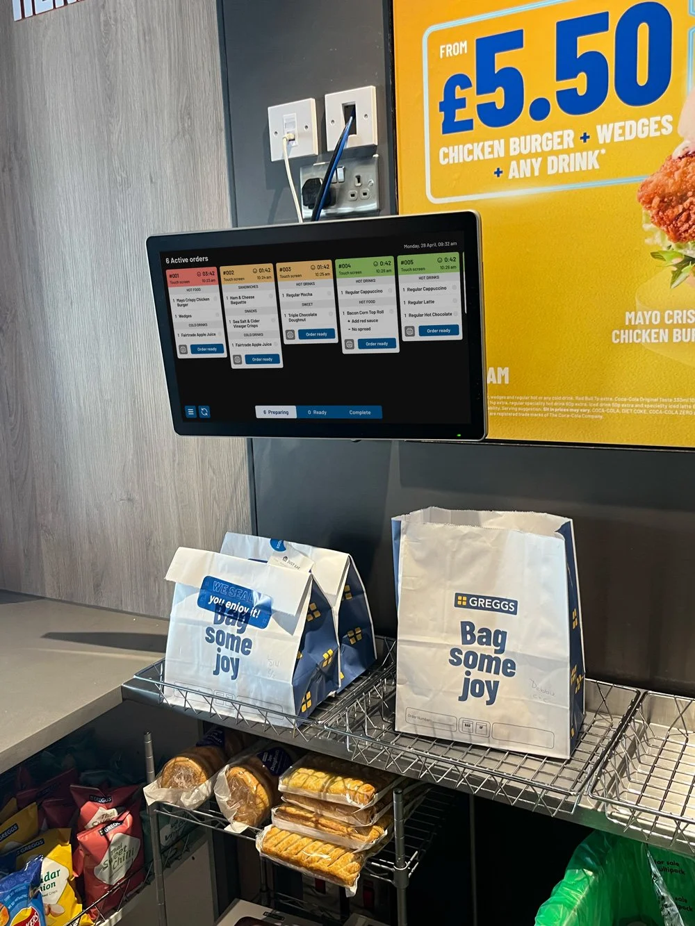
The Kitchen Management System officially launched alongside the customer-facing touchscreens in seven local trial shops. This rollout gave me the opportunity to observe how the system performed across different shop formats and varying levels of demand throughout the day. One of the most revealing periods was breakfast, which proved consistently busy in all trial locations. Despite the high volume of orders during these peak hours, the system handled the pressure smoothly - providing clear visibility and control for colleagues on the ground.
It was encouraging to see how confidently teams navigated the interface, efficiently managing incoming orders without delays or confusion. This trial phase not only validated key design decisions but also highlighted the system’s scalability and effectiveness in fast-paced, high-pressure environments.
Despite the overall success of the system during the trial phase, I continued working closely with shop colleagues to identify areas for improvement. Their day-to-day experience provided valuable feedback that helped uncover small but meaningful friction points in the workflow.
A few key issues came to light:
Navigating between tabs: The three-tab system, designed to represent different stages of order progress, was sometimes inefficient in practice. Colleagues occasionally forgot to return to active orders, meaning some orders were missed or delayed in preparation.
Hidden items on long orders: On larger orders, items that appeared below the fold weren’t always noticed. Without a clear visual cue or scroll indicator, it wasn’t obvious that more items needed attention.
Lack of audio notifications: Colleagues expressed a need for a sound alert when a new order arrived. During busy periods, visual updates alone weren’t always enough to catch their attention—especially when multitasking across different stations.
further enhancements
In response to the feedback, I streamlined the order ticket workflow by allowing orders to be marked as both ‘ready’ and ‘handed to customer’ from a single screen. This removed the need to switch between tabs, making the process faster and more intuitive for colleagues.
I also introduced sound notifications for new orders, enabling colleagues to focus on other tasks around the shop without constantly monitoring the screen - helping them stay efficient without missing new orders.
Finally, I added clearer visual cues to indicate when an order ticket had additional items below the fold, making it easier for colleagues to spot and scroll through longer orders without missing anything.